Hi everyone, I’m Viktor from Bitrise, we just released new improvements to the Breakdown Chart in Bitrise Insights, and this is a quick walkthrough on how to leverage those Breakdown Chart improvements, including new filtering options, exporting data, and more.
Let’s start with a quick summary of how the intelligent Breakdown Chart worked and what problems it presented. Then, we’ll see how these improvements eliminate those problems.
Problem #1: When too many lines were present at the same time on the chart, it was really hard to check and follow through the ones which had a negative trend but weren’t significant outliers.


Problem #2 : When there was an outlier, it was really hard to check the other, non-outlier lines:

So, what did we change?
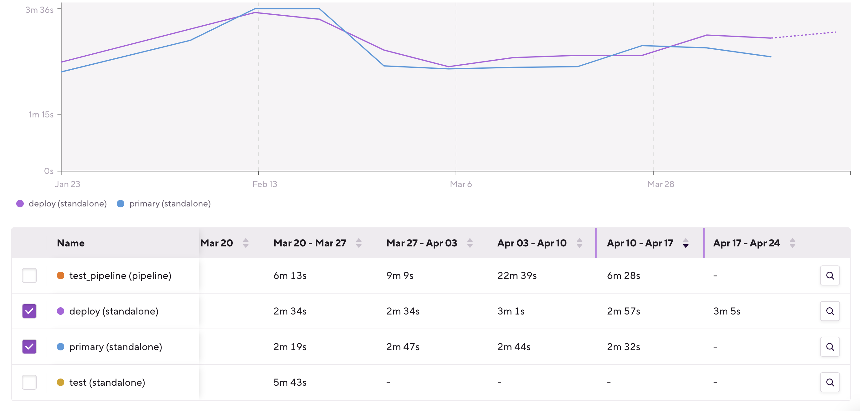
We added additional chart controls around the Breakdown Chart. First, we added a legend under the chart, so that you don’t have to hover over all the lines to see which one is which:

The second change is probably the most significant one: We added a Breakdown Table under the Breakdown Chart.

With this table, you can see how the values on the breakdown chart changed over time. You can also sort them based on a given hour, day, week or month; so you’re now able to answer questions like “Which workflows were the slowest in this app last week?”.
You can also check and uncheck any of the items in the Breakdown Table and that’ll be reflected on the Breakdown Chart as well. With this you can compare just 2 or 3 items for example.
Additionally, when you click on the magnifier glass icon ![]() in the Breakdown Table, that’ll add the relevant filters for you. With this you can quickly dig into and navigate through Apps → Pipelines → Stages → Workflows → Steps, for example, without leaving the Breakdown Chart and Breakdown Table.
in the Breakdown Table, that’ll add the relevant filters for you. With this you can quickly dig into and navigate through Apps → Pipelines → Stages → Workflows → Steps, for example, without leaving the Breakdown Chart and Breakdown Table.
When you have more than 10 items you can use the dropdown selector above the Breakdown Chart to filter down to just the top 10, top 5, bottom 5, bottom 10 items, or select “Custom” or “None”, and then use the Breakdown Table to select the ones you want to see and compare:

Above the Breakdown Chart, on the left-side of this selector, you can also find an Export Data option, with which you can export the breakdown data and slice it any way you like it.

Last but not least, we moved the Related builds section to a new tab, because that list is related to the upper chart, to the selected filters, and also this way if you’re interested in the Related builds you don’t have to scroll through the Breakdown Chart and the Breakdown Table to get to the related builds list.

As always, we’d love to hear what you think about these changes or if you have any questions or feedback about Bitrise Insights. Please let us know using the Give feedback button in the bottom left corner of the Bitrise Insights sidebar.

Happy data digging!